What on-page factors are associated with sites that see big gains or declines after Google updates? Turns out it’s not author boxes.
Throughout 2023, Google released a series of Core, Spam, Review, and Helpful Content Updates (HCU) that caused many sites to lose significant traffic and seemingly few to win.
For site owners specifically hit by Google’s HCU, Google said they could recover if they simply removed unhelpful content.
Google’s guidance—while well-intentioned—is sufficiently broad that, at this point, nearly nobody has figured out yet how exactly to recover their traffic.
Google’s release of the HCU followed several earlier announcements, a number of which many believe were most significant:
- The addition of “Experience” to the concept of Expertise, Authority, and Trust (E-E-A-T), emphasizing demonstrated experience in content Google wishes to reward.
- Changes to Google’s Quality Rater Guidelines to place greater emphasis on effort, originality, and creator information when evaluating content.
- Updated guidance on Page Experience signals (UX) and how they would be incorporated into Google’s Helpful Content ranking system.
Working as an SEO—and part-time as a Google Quality Rater—I’ve looked at 100s of sites impacted by Google updates. And while patterns sometimes seem obvious, I knew firmer data would be valuable.
We know Google’s algorithms draw on many different types of data: on-page factors, user interaction signals, and off-page signals (e.g., links), to name a few. For this study, I looked at on-page factors, including on-page elements related both to UX and demonstrated experience, to see if we could tease out any insight.
A Study of Google Winners and Losers
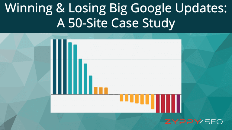
To get a clearer picture, I examined 50 sites that either lost or gained significant organic traffic across Google updates between August and December of 2023. The selected sites saw traffic changes ranging from -67% to +5,595% over this period.
The sites—both the winners and losers—were nearly all “content” sites, monetized through advertising and affiliate revenue (although a small number were monetized in other ways, such as selling digital products.)
From there, I hand-collected over 2,500 data points regarding UX and on-page elements. For each site, I examined the live URL that lost the most traffic during the time period. All sites were evaluated on mobile. Finally, I looked for correlations and relationships in the data.
You can see the complete data set here. I’ve hidden the URLs to shield the site owners from unwanted attention.
Below, you can see the top results. Features with a positive correlation were associated with an increase in Google visibility, while features with a negative correlation were associated with decreased visibility.

Caveats and Disclaimers:
- While the included sites represent a good cross-section of the web, this is a very small sample size. You should take all studies like these with a grain of salt.
- The study attempts to identify features associated with winning and losing sites. Importantly, these are not ranking factors, nor is anyone claiming them to be. While Google’s machine learning algorithms may associate these features with “Quality” or other ranking considerations, we simply can’t say for sure.
- Importantly, correlation is not causation (in case this is your first rodeo.)
Interestingly, while the data doesn’t reveal a single “smoking gun” that’s 100% correlated with lower or higher traffic, the effects seem to be additive when sites combine features together.
For example: sites that combined a fixed footer ad, scrolling video, and a lack of personal experience had an 83% chance of being in the “losing” group.
On the flip side, sites that used a high number of first-person pronouns and didn’t use stock images had an 83% chance of being in the “winning” group.
Keep in mind while many of these features saw positive or negative correlations, not all of these correlations were statistically significant (hello, author pages!)
In total, 17 stand-alone features showed at least some statistical significance. Let’s go over each of them below.
Most Highly Correlated On-Page Features
Here, you can see the most statically significant features along with their Pearson correlation coefficients, if they were negatively or positively associated with traffic, and the strength of evidence. A complete list can be found at the bottom of this post.
1. Fixed Ad – Footer
Association: Negative | Correlation: -0.522 | Evidence: Very Strong
This describes an advertisement affixed to the footer of the page that “scrolls” with the user, often covering up Main Content (MC.) This seems related to Google’s Quality Rater guidelines stating the importance of “… Ads and SC do not block or significantly interfere with the MC.”
2. Fixed Video Ads
Association: Negative | Correlation: -0.52 | Evidence: Very Strong
This describes an auto-play video ad that follows the user while they scroll. While these ads can often be dismissed, it’s not always easy to do so, and the effect results in covering a significant amount of content.
As Google’s guidance on page experience asks, “Does the content lack an excessive amount of ads that distract from or interfere with the main content?” it may come as no surprise that different types of fixed ads were the most associated with traffic drops in this study.

3. Stock Images
Association: Negative | Correlation: -0.403 | Evidence: Strong
This describes when a site uses stock images or any images where it is clearly not the original source. This includes the use of unaltered product or manufacture images. For this study, if any of the prominent images on the page were not original, then they were placed in this bucket.
That Google may want to reward more unique images could be related to Google’s increased emphasis on “originality” in both guidance around Helpful Content and instructions to Search Quality Raters.
4. First-Person Pronouns
Association: Positive | Correlation: 0.383 | Evidence: Strong
First-person pronouns include words such as “I,” “we,” “my,” and “ours.” (These differ from second and third-person pronouns such as “you,” “yours,” “her,” and “his.”) For this study, I created a small program that counted the number of first-person pronouns in the first 1000 words of each URL’s Main Content.
Examples include phrases such as:
- We found this pillow the most comfortable in our tests.
- Here’s where I made a mistake on my tax form.
- When we showed up at the restaurant, the owner greeted us at the door.

This result is perhaps the most surprising and potentially useful. As Google updated their Quality Rater Guidelines to place new emphasis on sites that demonstrate “first-hand or life experience for the topic,” it makes sense that sites that describe their personal expertise might do better in search.
5. Number of Ads
Association: Negative | Correlation: -0.383 | Evidence: Strong
This describes the total number of video and/or image ads on the page.
While both winning and losing sites each displayed ads, losing sites were more likely to show ads (80%) than winning sites (52%.) Beyond this, losing sites also showed more ads, on average, than winning sites. Two of the sites in the losing group showed up to 38 ads on a single page, while the highest number of ads in the winning group was 25.
Even if you remove the sites with no ads from the analysis, there’s still a large difference in the data. In this case, winning ad sites contained 12.2 ads per URL, while losing ad sites displayed an average of 17.6 ads, or 44% more.
6. First-Hand Experience
Association: Positive | Correlation: 0.333 | Evidence: Strong
This describes any page that demonstrates first-hand experience with the content, as described by Google’s Quality Rater Guidelines and is closely related to “First-Person Pronoun” use above.
This quality is somewhat objective, and I leaned on my experience working as a Quality Rater to judge if the creators of the content demonstrated personal experience with the subject. For example, if it was a travel site, did the creators explain their personal experience with the location? For products, did they describe how they used the product or provide unique images or videos of themselves using the product?
One way to evaluate first-hand experience is to ask yourself, “Could this content be created by anyone researching the internet, or did the creator use unique, first-person experience to create the content?“
7. Cookie Consent
Association: Positive | Correlation: 0.333 | Evidence: Strong
Surprisingly, sites that displayed a cookie consent banner typically did better than sites that did not. This may be an excellent reminder that “correlation doesn’t equal causation.” It could be that higher-quality sites are more likely to use cookie consent screens. Or it could mean Google’s machine algorithms have learned to associate cookie banners with high-quality sites.
Or it could mean nothing at all. It’s worth noting that all sites were evaluated in the United States, where site owners often exclude cookie banners by default (although Mountain View, where Google views content, is also located in the United States.)
8. Notifications
Association: Negative | Correlation: –0.333 | Evidence: Strong
This describes any site that uses browser push notifications. Users often find them annoying, and it’s unsurprising that they are associated with losing sites. It’s worth noting that out of all the sites in this study, not a single winning site used push notifications.
9. Mega Menu – Head
Association: Negative | Correlation: –0.333 | Evidence: Strong
This describes a large navigational menu at the top of the website, usually expandable, containing a large number of links. For this study, the standard was 30 links or more, though most mega menus were much larger.
Mega menus weren’t included in the original study design. However, as I examined each site, I noticed many of the losing sites had them, and I recall many losing sites that I consulted with in the past year had them as well, so I wanted to see if there was a relationship.
Mega menus can be helpful to users, but they are often created for SEO purposes. This could relate to Google’s guidance on avoiding content “primarily made to attract visits from search engines.” Alternatively, Google may be doing something with anchor text optimization with these updates, as mega menus are known to possibly decrease anchor text diversity due to selective link priority.
10. Contact – Footer
Association: Positive | Correlation: 0.3 | Evidence: Moderate
This describes when a site clearly displays contact information at the bottom of the page. As Google’s updated Quality Rater Guidelines place extra emphasis on “finding who is responsible for the website and who created the content on the page,” I wanted to see if there was a relationship between contact information and traffic changes.
Out of ten sites total that didn’t display any contact information in the footer, eight were losing sites.
11. Unclear/Missing Logo
Association: Negative | Correlation: –0.295 | Evidence: Moderate
This describes when a site doesn’t display a logo (especially on mobile) or when the logo is unclear. The use of logos seems relevant as they can help identify who is responsible for the site and who created the content.
Only four websites met this criteria, but every one of them was found in the “losing” group.
Logos can also help demonstrate E-E-A-T. For example, if your search query is “Boston Tourism” and you see the Meet Boston logo, you might reasonably decide this site has experience with Boston travel.
Note: Some sites choose to hide their logo on mobile. As the majority of searches take place on mobile, and both Google and its Quality Raters are known to evaluate sites using their mobile versions, site owners may want to consider the wisdom of hiding logos on any screen.
12. Search – Footer
Association: Negative | Correlation: –0.295 | Evidence: Moderate
This describes any site that displays a search function near the bottom of the page. Like “Cookie Consent” above, it’s difficult to determine why this may be negatively associated with traffic change. It may simply be an aberration of the data, or it may be a pattern of lower-quality sites we can’t simply tease out.
13. Missing Contact
Association: Negative | Correlation: –0.288 | Evidence: Moderate
This describes when a page has no contact information listed anywhere on the page. As mentioned earlier, Google instructs Quality Raters to search for contact information when looking for information about who is responsible for the website content.
Most sites in the study listed contact information somewhere on the page. However, out of seven sites with missing contact information entirely, six were in the “losing” group.
14. Any Contact
Association: Positive | Correlation: 0.288 | Evidence: Moderate
This describes when a page displays contact information anywhere on the page. This is simply the reverse of the “Missing Contact” above. As negative factors can sometimes be easily changed to positives—depending on how you looked at them—I simply wanted to demonstrate how displaying contact information was positively associated with traffic.
15. Any Mega Menu
Association: Negative | Correlation: –0.284 | Evidence: Moderate
This describes when a page displays a mega menu (explained above) anywhere on the page. Sometimes, sites include mega menus in the footer instead of, or in addition to, the head.
While this study didn’t find as strong of negative correlation with mega menus specifically placed in the footer (-0.058, p-Value 0.690931), overall mega menu usage was moderately correlated with lower traffic.
16. # of Affiliate Links
Association: Negative | Correlation: –0.248 | Evidence: Weak
This describes the total number of affiliate links on a given URL.
Losing sites were more likely to have affiliate links than winning sites – 64% vs 36%. Losing sites also used more affiliate links, on average, than winning sites. The highest number of affiliate links on any single page in the winning group was 43, while the highest number of affiliate links in the losing group was 145.

That said, while this finding is statistically significant, the strength of the evidence can be classified as “weak.” Indeed, the negative relationship with affiliate links is far weaker than the relationship with ads. It may be that because ads represent a visual experience that can more greatly interrupt the user’s page experience, Google is more likely to demote ad-heavy sites.
17. Privacy Anywhere
Association: Negative | Correlation: –0.246 | Evidence: Weak
This describes when a URL links to a privacy policy, anywhere on the page.
This result may be surprising, as we are often told that privacy policies are good for user experience and establishing trust. On the flip side, spammers and low-quality affiliates are often the first to add privacy pages for exactly this reason. So it may be no surprise to see a weak correlation with lower traffic.
Other Correlations and Evidence
Listed below, you can see the complete results, including features with no statistically significant correlation with traffic.
Importantly, this study found no statistically significant relationship between author information (including on-page information such as author boxes), word count, editorial policies, use of copyright, affiliate disclosures, or many other factors. It could be that these elements are so common and ubiquitous on the web that their presence is simply noise to Google’s algorithms, and no reliable pattern could ever be discerned from their presence.
| Feature | Correlation | p-Value | Evidence |
| Fixed Ad – Footer | -0.522 | 0.000102 | Very Strong |
| Fixed Video Ads | -0.52 | 0.000109 | Very Strong |
| Stock Images | -0.403 | 0.003719 | Strong |
| First-Person Pronouns | 0.383 | 0.006041 | Strong |
| # of Ads | -0.373 | 0.007633 | Strong |
| First-Hand Experience | 0.333 | 0.018006 | Strong |
| Cookie Consent | 0.333 | 0.018006 | Strong |
| Notifications | -0.333 | 0.018006 | Strong |
| Mega Menu – Head | -0.333 | 0.018006 | Strong |
| Contact – Footer | 0.3 | 0.034286 | Moderate |
| Unclear/Missing Logo | -0.295 | 0.037628 | Moderate |
| Search – Footer | -0.295 | 0.037628 | Moderate |
| Missing Contact | -0.288 | 0.042398 | Moderate |
| Any Contact | 0.288 | 0.042398 | Moderate |
| Any Mega Menu | -0.284 | 0.04591 | Moderate |
| # of Affiliate Links | -0.248 | 0.083058 | Weak |
| Privacy Anywhere | -0.246 | 0.08482 | Weak |
| # of CTAs | -0.226 | 0.115263 | None |
| Search – Head | -0.211 | 0.141132 | None |
| Any Author Info | -0.211 | 0.141132 | None |
| CTA – Footer | -0.211 | 0.141132 | None |
| Social Links – Footer | -0.211 | 0.141132 | None |
| Contact – Head | 0.206 | 0.151175 | None |
| CTA in Head | 0.178 | 0.215735 | None |
| Editorial Policy | -0.173 | 0.229808 | None |
| Word Count | -0.161 | 0.264 | None |
| Copyright | -0.156 | 0.278788 | None |
| Affiliate Disclosure | -0.124 | 0.392411 | None |
| Linked Author Page | -0.124 | 0.392411 | None |
| Social Links Head | 0.109 | 0.450694 | None |
| Active Comments | -0.086 | 0.553787 | None |
| Fixed Ad Head | -0.058 | 0.690931 | None |
| Mega Menu Footer | -0.058 | 0.690931 | None |
| Intrusive Interstitial | -0.052 | 0.719566 | None |
| Fixed Scroll Nav | -0.046 | 0.753201 | None |
| Table of Contents | 0.042 | 0.77096 | None |
| About – Footer | 0.041 | 0.776326 | None |
| Author Links | -0.041 | 0.779937 | None |
| On Page Author Info | -0.041 | 0.779937 | None |
| Author Photo | 0.04 | 0.782702 | None |
| About – Head | 0 | 1 | None |
| Descriptive Navigation | 0 | 1 | None |
Can You Recover From Google’s Helpful Content Update?
This is the multi-billion dollar question. In truth, the answer is we simply don’t know yet. While Google indicates it is indeed possible to recover from its Helpful Content system, there have been few, if any, verifiable “recoveries” documented on the web.
That said, if I were to give advice to webmasters looking to regain lost HCU traffic, here’s what I would advise based on the results of this study:
- Reduce Ad Coverage. This includes removing/reducing ads that are fixed on user scroll, as well as auto-playing video ads that also can cover content when scrolling. In-content ads appear to be less damaging to the page experience, but if you have a lot of them, you should evaluate how they may detract from the main content.
- Reduce the Use Of Stock/Unoriginal Images. Based on these results, strongly consider removing unoriginal images, and replacing any stock images that you already use whenever possible. (For large sites, this could be a formidable task without a clear guarantee of benefit.) It’s typically better to photograph products, places, and things yourself, or even modify existing images to add unique value.
- Demonstrate First-Hand Experience. Avoid creating content that anyone on the internet could create with surface-level research. Show the user that you actually have experience with the subject at hand. For travel blogs, show that you’ve actually visited the places you write about. For products, show how you’ve actually used them. This advice 100% aligns with Google’s guidance on producing content, so it may be a good approach to aspire to.
- Make Your Contact Information Easy To Find. While this feature wasn’t as highly correlated with the ones above, making it easy to discover who is responsible for the site was associated with positive traffic change in every instance we looked at it.
- Strive For Originality: While not covered in this study, Google explains over and over again that one of the goals of the HCU is to reward “original” content over “low-added” content. Since search engine-first content often lacks originality (because everyone optimizes with the same tools and covers the same topics and keywords), the concept of information gain comes into play. Strive to completely cover topics in a way that makes it clear you’re using “original information, reporting, research, or analysis.”
How Long Does It Take To Recover From Google’s HCU?
While Google says it is indeed possible to recover from the HCU, the timeframe is even more unknown.
Google has stated it might take “several weeks to several months” for sites to see recovery. Unfortunately, this means a long time to see results and makes it challenging to relate any changes that you make today with changes in traffic that may take multiple months down the road.
Final Thoughts, Is It Worth It?
Keep in mind that Google gathers data from many sources, including directly from its users! While this study found many strong correlations between traffic changes and UX/on-page factors, it’s possible that recent Google updates, including the HCU, rely more on other data sources, such as user interactions.
That said, everything in SEO connects to everything else. Perhaps reducing the number of fixed scroll ads directly influences Google’s machine learning algorithms, or perhaps it simply provides a better user experience that Google sees by collecting user data.
Either way, it’s tough to decide what to invest in.
Regardless of how we may feel about it, it is clear Google is nudging the web in a direction of its choosing, and it’s up to us if we want to follow.
Have you seen anything interesting with Google’s HCU? Let me know on LinkedIn, Twitter, or Threads!
Study Methodology
Over 100 candidate websites were chosen for analysis, and their Google visibility was recorded via Ahrefs estimates covering a timespan from August 17th to December 19th, 2023. After removing outliers, the 50 sites with the most consistent wins or losses were chosen for final inclusion. Website features were documented at the end of December. All websites were evaluated from the United States using mobile emulation on a Chrome browser. Pearson correlation coefficients were calculated between each feature and the target variable to measure the linear relationship between them. To determine the statistical significance of the observed correlations, a t-test was performed for each feature’s correlation coefficient. The null hypothesis stated that the true correlation coefficient was zero (no correlation). P-values were computed to assess the probability of observing the correlation coefficients under the null hypothesis. A p-value threshold of 0.05 was used to determine statistical significance. Special thanks to Paul P, Thomas Jepsen, and Shane Dutka for their public work, which aided site selection.